
Today I want to talk a little about layout design for a professional look. Keep in mind while designing your book that you want unity yet some variety throughout. You can pull unity in by keeping your fonts the same through the book and using some type of grid for picture and text placement. For some variety to keep the book interesting while paging through it, you could do some fun things with color or textures or even adding some fun quotes here and there just to break up the monotony of photos.
For my book I want to keep a clean, sleek design. In the design world, less is more. So I am having lots of white space with splashes of color here and there for interest. I picked two fonts, Bookman Old Style and Miss Brooks. Most times it is best to never use more than two fonts... or you'll get a messy look. However I have seen where 3 fonts do work but you have to be really careful. It is your book though, so I'm just offering suggestions... do what makes you happy! Here is the cover design I came up with for my daughters first year:
 {digital photo book cover}
I thought the font Miss Brooks was a nice handwritten font that would give a more intimate feel when trying to portray my heartfelt thoughts to my daughter. There are several free fonts on the web if you don't have many on your computer. Just do a google search: Free Fonts and you can download them.
My pops of color are going to be digital scrapbooking pages. Thanks to Shabby Princess who offers these beautiful download pages for free! There are several other places you can find scrapbooking paper by doing a google search again, or you may choose to do solid colors or take pictures of different textures to use for backgrounds... there are so many options.
Now lets talk about having an introduction page. This is a great page for tying in the cover to what the rest of the book is about. It gives a more professional look to the book. Here is what I came up with:
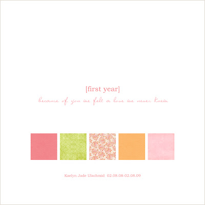 {introduction page}
Its best to keep this page pretty simple. This page would work great for favorite quotes that are relevant to your book's theme. I used the same blocks in the same place that are on the front to keep the unity. The fonts are also the same. I hoping that I'm able to use the floral design block as a full color page for the inside of the covers... this would add some nice variety.
Now that the cover and introduction are complete we can start on the body of the book. I've been breaking my photos down into sections. I picked my favorites for my first section which will be pregnancy and will share some design tips about those pages next Wednesday.


1 comment:
I'm really impressed with your writing skills as well as with the layout on your blog. Is this a paid theme or did you customize it yourself? Anyway keep up the excellent quality writing, it's
rare to see a nice blog like this one today.
only dr scott tucker plastic surgery neither scott tucker mortgage summit
Also see my site > fifth scott tucker artist texas
Post a Comment