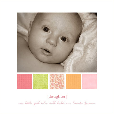
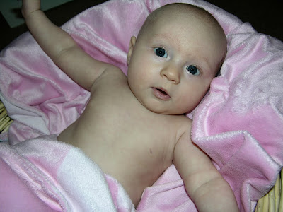
 For the cover photo, I first started with the photo below. I first cropped the image to what I thought would look the best for an up close view for the front of the book. Cropping and playing with the rotation of your pictures can make them look entirely new and give a more professional look.
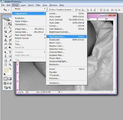
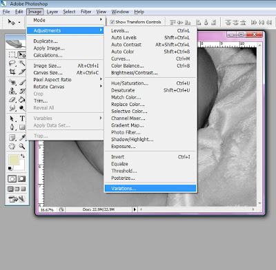
 After cropping I decided I would like to make the photo sepia... a nice brownish tint. So to do this you go to Image at the top of the screen, down to Adjustments, then over and down to Hue/Saturation.
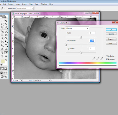
 When your in Hue/Saturation, set the saturation to -100. This makes your image black and white. Click OK.
Then go back to Image at the top of your screen, go to Adjustments again and down to Variations.
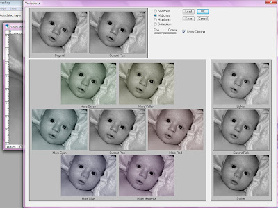
 Here you first need to find the bar with Fine and Course. Midtones should already be selected above it. There should be a moveable bar that automatically comes up in the middle, so you want to move it to the left, ONE notch. (See photo below.) Then click on More Yellow once, and then click on More Red once. Click OK.
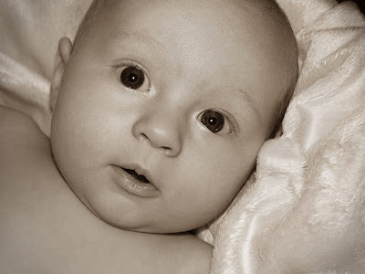
 Now you should have a beautiful sepia photograph!
Now on to brightening up photos. This works excellent for color photos, as well as black and white. If the Layers Window is already a good friend of yours, make it one. You can do so much with it! If it doesn't automatically show on your screen go to Window at the top and down to Layers. When you have it up, make a copy of your background by clicking the top right arrow and going down to Duplicate Layer...
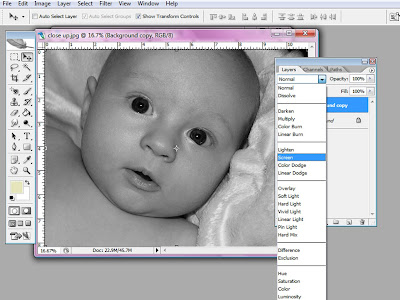
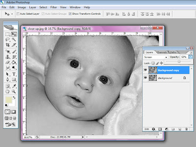
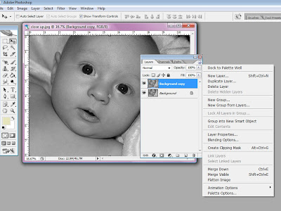 With this new duplicate layer selected in blue go to the arrow that points down next to Normal. You can play around with a bunch of these options but for now I'm going with the one called Screen to lighten my photo.



No comments:
Post a Comment